Transforms
 With CSS3 came new ways to position and alter elements. Now general layout techniques can be revisited with alternative ways to size, position, and change elements. All of these new techniques are made possible by the transform property. The transform property comes in two different settings, two-dimensional and three-dimensional. Each of these come with their own individual properties and values
Transform Syntax
 The actual syntax for the transform property is quite simple, including the transform property followed by the value. The value specifies the transform type followed by a specific amount inside parentheses.
div { -webkit-transform: scale(1.5); -moz-transform: scale(1.5); -o-transform: scale(1.5); transform: scale(1.5); }
2D Transforms
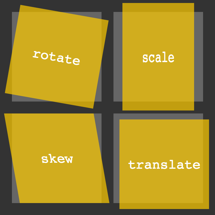 Elements may be distorted, or transformed, on both a two-dimensional plane or a three-dimensional plane. Two-dimensional transforms work on the x and y axes, known as horizontal and vertical axes. Three-dimensional transforms work on both the x and y axes, as well as the z axis. These three-dimensional transforms help define not only the length and width of an element, but also the depth. We’ll start by discussing how to transform elements on a two-dimensional plane, and then work our way into three-dimensional transforms.
2D Rotate
2D Scale
/scale.png)
2D Translate
/translate.png)
2D Skew

Combining Transforms
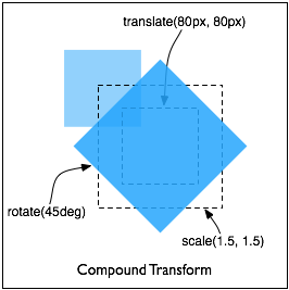
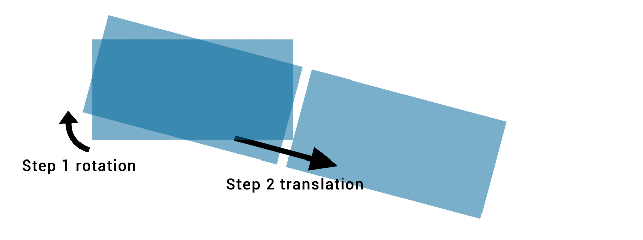 It is common for multiple transforms to be used at once, rotating and scaling the size of an element at the same time for example. In this event multiple transforms can be combined together. To combine transforms, list the transform values within the transform property one after the other without the use of commas.
Transitions & Animations
 One evolution with CSS3 was the ability to write behaviors for transitions and animations. Front end developers have been asking for the ability to design these interactions within HTML and CSS, without the use of JavaScript or Flash, for years. Now their wish has come true.
Transitions
As mentioned, for a transition to take place, an element must have a change in state, and different styles must be identified for each state. The easiest way for determining styles for different states is by using the :hover, :focus, :active, and :target pseudo-classes.
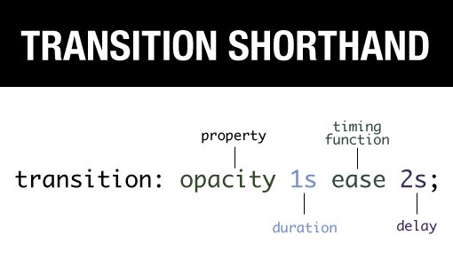
- Transitional Property

Animations
Transitions do a great job of building out visual interactions from one state to another, and are perfect for these kinds of single state changes. However, when more control is required, transitions need to have multiple states. In return, this is where animations pick up where transitions leave off.
- Animations Keyframes
8 Simple CSS3 Transitions That Will Wow Your Users
- Fade in (
.fade { opacity:0.5; } .fade:hover { opacity:1; }
)
- Change color (
.color:hover { background:#53a7ea; }
)
- Grow & Shrink (
.grow:hover { -webkit-transform: scale(1.3); -ms-transform: scale(1.3); transform: scale(1.3); }
)
- Rotate elements (
.rotate:hover { -webkit-transform: rotateZ(-30deg); -ms-transform: rotateZ(-30deg); transform: rotateZ(-30deg); }
)
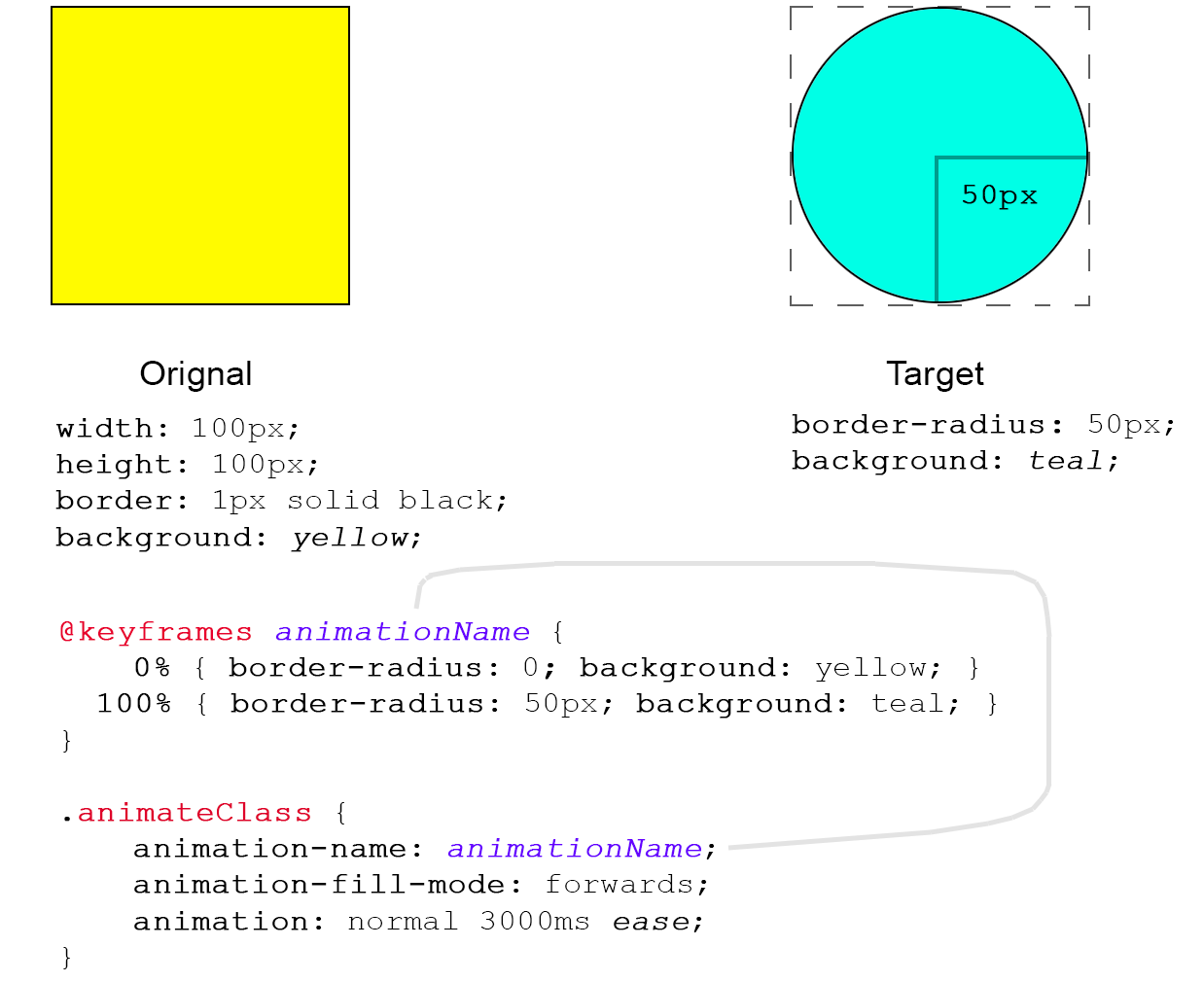
- Square to circle (
.circle:hover { border-radius:50%; }
)
- 3D shadow (
.threed:hover { box-shadow: 1px 1px #53a7ea, 2px 2px #53a7ea, 3px 3px #53a7ea; -webkit-transform: translateX(-3px); transform: translateX(-3px); } )
- Swing (
@-webkit-keyframes swing { 15% { -webkit-transform: translateX(5px); transform: translateX(5px); } 30% { -webkit-transform: translateX(-5px); transform: translateX(-5px); } 50% { -webkit-transform: translateX(3px); transform: translateX(3px); } 65% { -webkit-transform: translateX(-3px); transform: translateX(-3px); } 80% { -webkit-transform: translateX(2px); transform: translateX(2px); } 100% { -webkit-transform: translateX(0); transform: translateX(0); } } @keyframes swing { 15% { -webkit-transform: translateX(5px); transform: translateX(5px); } 30% { -webkit-transform: translateX(-5px); transform: translateX(-5px); } 50% { -webkit-transform: translateX(3px); transform: translateX(3px); } 65% { -webkit-transform: translateX(-3px); transform: translateX(-3px); } 80% { -webkit-transform: translateX(2px); transform: translateX(2px); } 100% { -webkit-transform: translateX(0); transform: translateX(0); } }
) (
.swing:hover { -webkit-animation: swing 1s ease; animation: swing 1s ease; -webkit-animation-iteration-count: 1; animation-iteration-count: 1; }
)
- Inset border (
.border:hover { box-shadow: inset 0 0 0 25px #53a7ea; }
)